
Disclaimer
Right off the bat, I’m not affiliated with Avira in any capacity, and the views for this case study are strictly my own. Since I don’t have full access to all the user data that influenced their current design, this case study is not fully comprehensive. This case study was done to enhance my learning experience and challenge myself to redesign it to serve a specific purpose.
Introduction
Avira Antivirus has a history of more than 30 years
protecting people in a connected world. Avira Antivirus Free and Pro are the main and
most sold product of Avira portfolio.
Recently, the UI of the Antivirus got
a new look and feel and was connected to the Avira Connect which is the central platform
for all Avira services and products.
Avira antivirus helps users to manage
all protection layers in order to keep the computer
safe against threats from the internet.
Why this Redesign? The Problem / Challenge
In these years, even if Avira have updated the UI, there are many usability challenges:
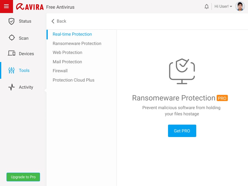
- Free users don’t understand the potential of paid protection layers of the Avira Antivirus
- Outdated parts (Scans, configuration) which are not upgraded to the new design concept yet
- User feedback is not reliable and takes a lot of time
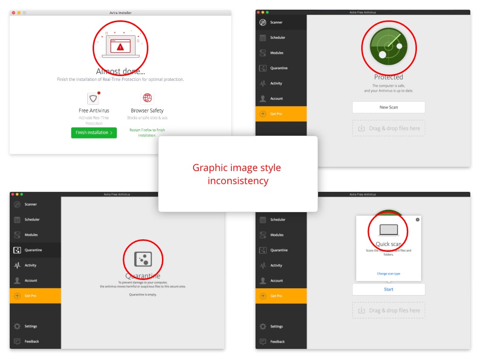
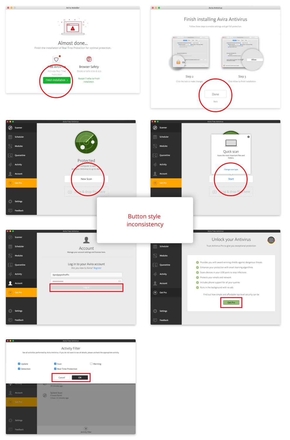
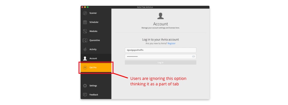
- UI Inconsistency due to lack of Style Guide and or Design system
After this exploration, I set out to reimagine the Avira app and improve the experience in any way I could
Goals and Motivation for redesign
My goals for the redesign:
- Improve and redesign the app to make it visually compelling and consistent
- Create a style guide to minimize visual discrepancies and communicate the Avira’s branding style
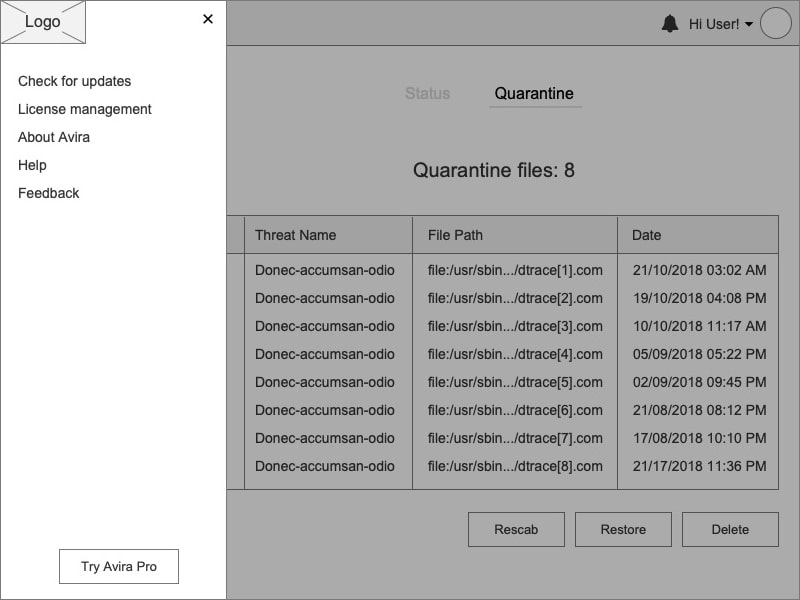
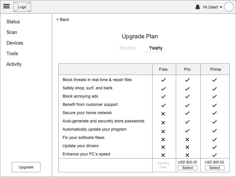
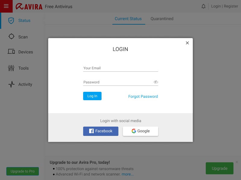
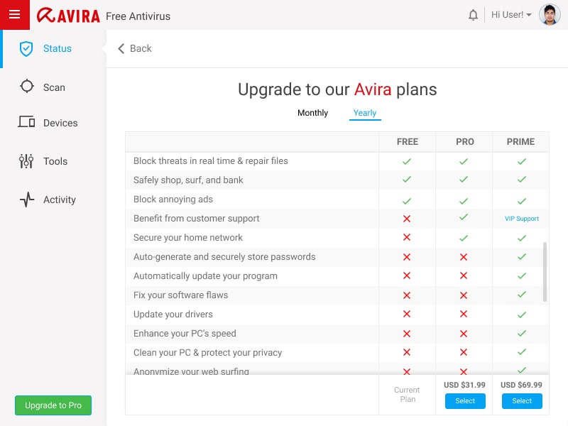
- Communicate clearly about the advantages of upgrading to pro version (e.g. “Avira Prime”)
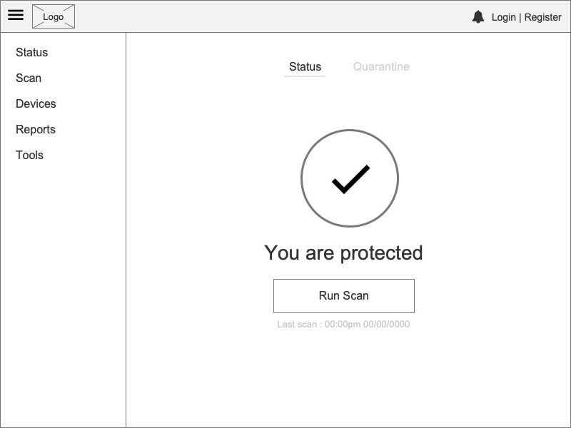
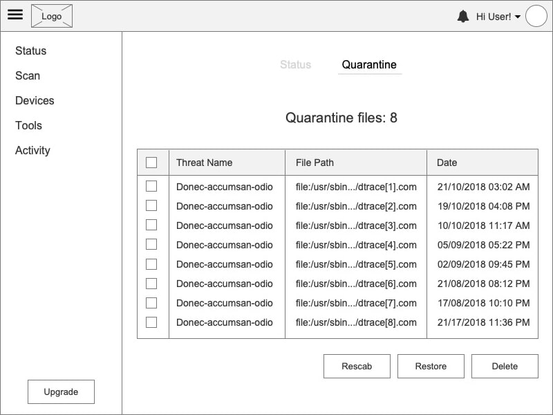
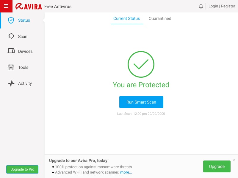
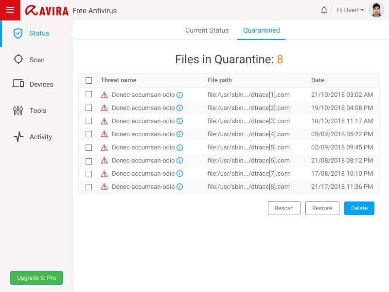
- Integrate a vision about how the “Quick scan” scanner should be redesigned and integrated in the main UI
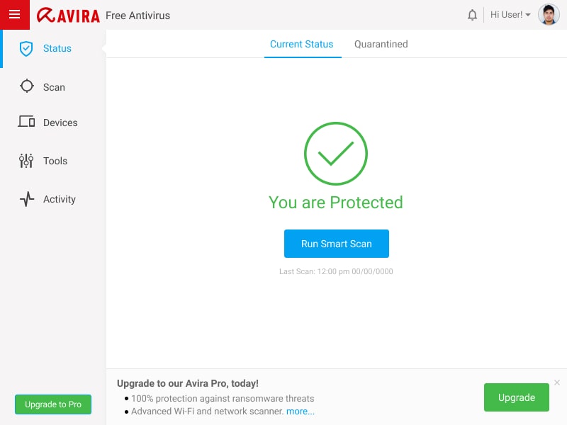
- Create a perception of the main view where customers have a better understanding about the Antivirus status and management, improving the user experience
My personal goals:
- Take full ownership of the various roles involved in designing a product such as a User Researcher, User Experience Designer, UI Designer, etc
- Enhancing my learning experience by challenging some design decisions and addressing their solutions
My role:
User Research, User Interviews, User Journey, Information Architecture, User App Flow, Wireframes, User Testing, Prototyping and Visual design
Tools:
Miro, Xmind, Axure RP Pro, Adobe XD
App Analysis / Ideation
Since I had already used the app and had some idea about it, I decided to do an in-depth
analysis of the app first. I also visited several blog posts, discussion threads, app
reviews, and gathered the pros and cons of Avira compared to its other competitors
so that I can understand the functionalities, overall architecture, and navigation.
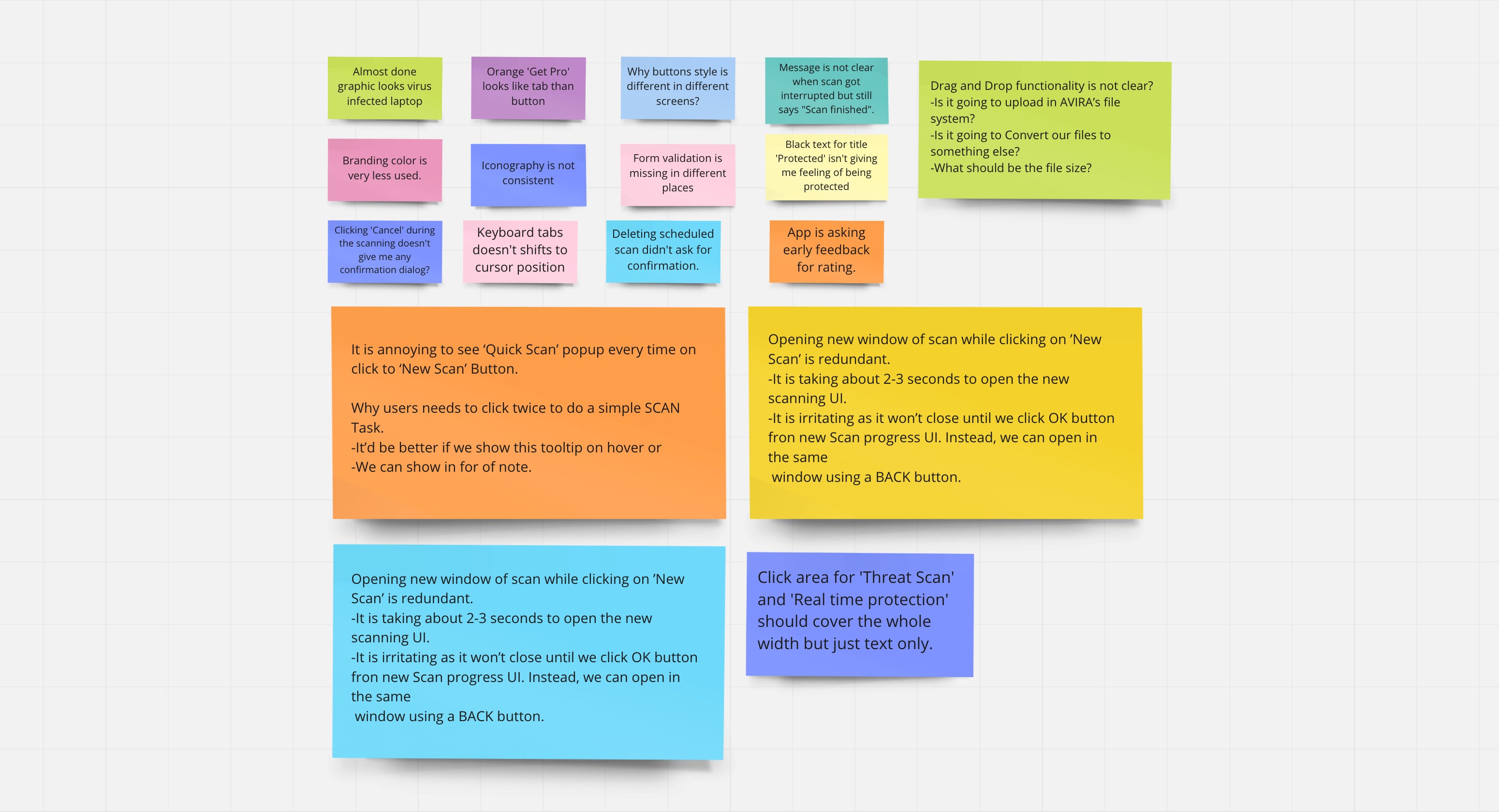
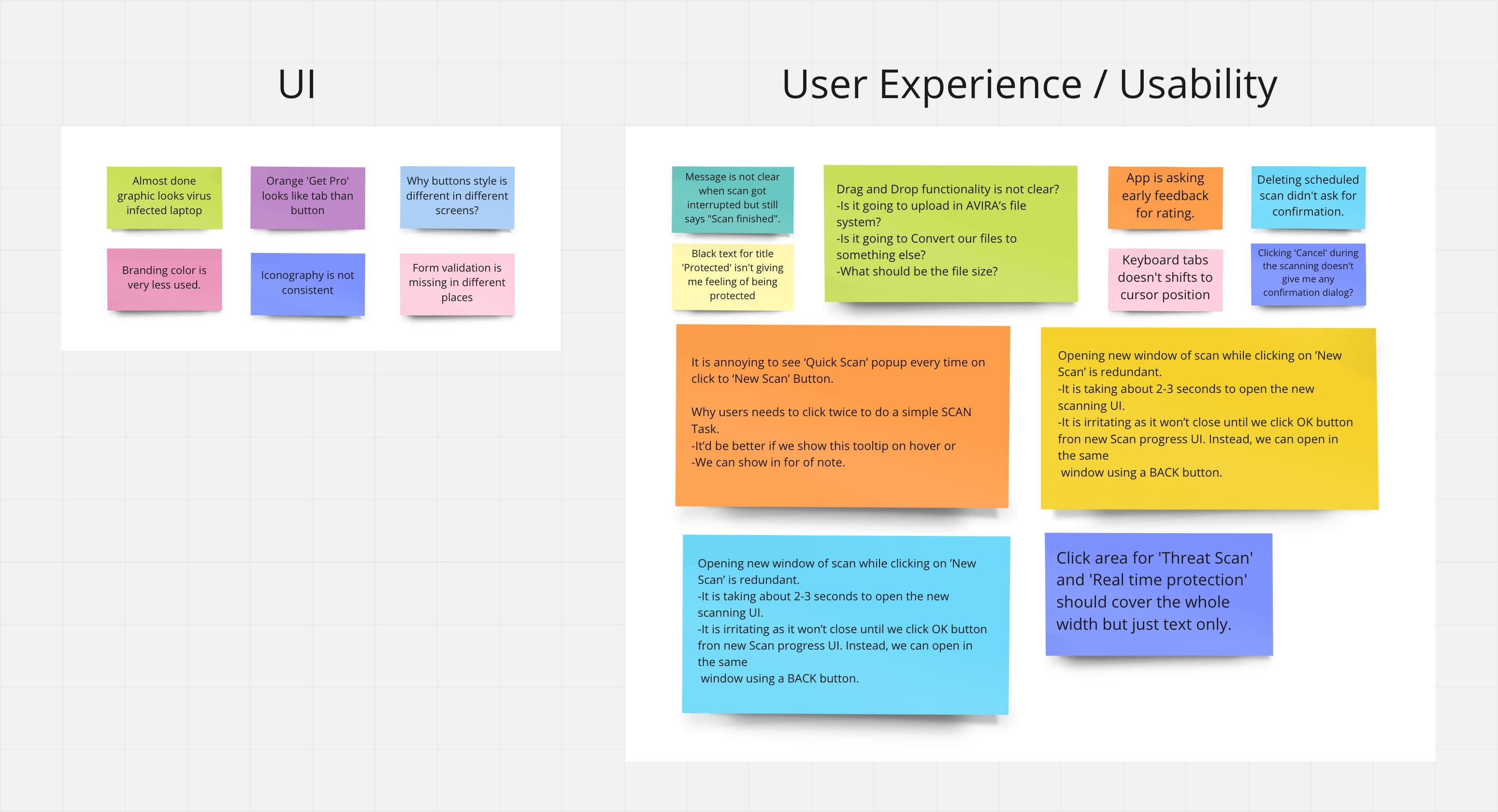
Through the analysis, I was able to identify some clear usability issues
and pain points. Then
I sorted the gathered information and identified the problems. It also helped me in
understanding the user perspective of what exactly they wanted. I also took the
screenshot of every screen and made note(s) of those issues.
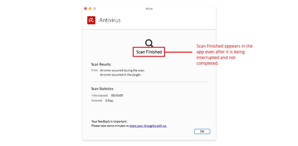
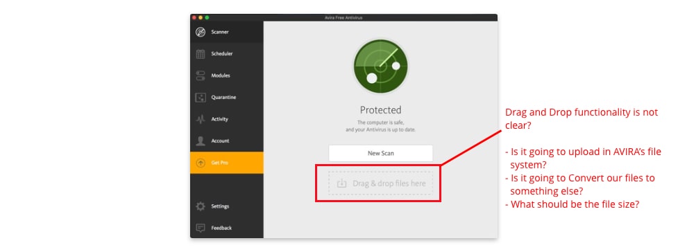
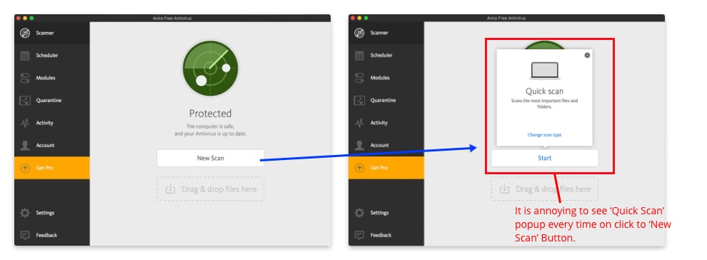
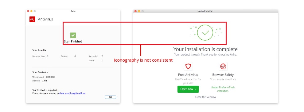
Below are a few
problems that I faced when I did some analysis of my own:
- Avira's branding in UI has not been followed
- The app failed on several WCAG 2.1 success criteria including the following:
- Color contrast ratio
- User feedback and Error suggestions
- Keyboard friendliness
- Graphics and iconography is not consistent
- UX copywriting is not shown based on the context
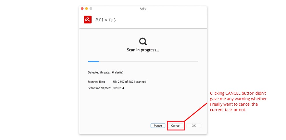
- Users are not getting proper feedback and confirmation for critical tasks
- Warnings and errors are not clearly differentiable
- Inappropriate use of Colors based on the contexts
- Button states design and position are not correct
- UI is a bit hard for new users so it needs to be more user-friendly
Understanding the users
According to Avira, more than 560 million installations have already been made worldwide.
User Interview
I started my user research by conducting user interviews with 5 users, which vary
from daily active users to infrequent users of any antivirus app to understand what
motivates or demotivates them from using antiviruses.
I conducted an
onsite field trip - user interview for this case.
The male
interviewees’ age ranged from 19 to 49 years old, while all 2 females ranged from 20
to 38 years old, which I felt was a fair representative
of Avira’s current user base.
Some key insights from the interview-
- The participants, who has antivirus installed in thir machine, scan their computer two to three times a week, mostly when they open the laptop and gets some sort of notifications
- Participants said that notifications grab their attention, and eventually, they end up opening the app while some even felt that endless notifications could get annoying
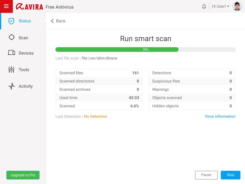
- Participants prefer Quick Scan than Scheduled scan and Full Scan
- Quick scan is their most used feature
- The participants said that they want their app to be customized but would always want to be aware of vital information such as Virus detection, Quarantined and or new updates
I also started looking for reviews on Avira’s customer support page. There were not many UI/UX related support cases but luckily did find a few on other websites.
Usability Testing
After the user interview, I asked the same participants (5
participants) to test the Avira Free Security app (Virtually and in-person Usability
Testing). I wanted to see how they would interact with the app’s features. (2 out
of 5 participants had not used the app before. I also wanted to test the app with
someone totally new to it, so I asked them to download and use the Avira Free Security
app for 1 week)
Some of the tasks that I
gave them during the testing were:
- Download and install the app from Avira’s official website
- Open the app and scan their computer for malwares or threats
- Turn on/off the notifications settings
- Find out if they found any viruses while scanning and where they can find it
- Watch a video that you find interesting
- Find out what they can get for free in the freemium version
- Schedule the scan everyday at 09:00pm for a week
Competitive analysis
Note: Since all the following apps require a premium subscription to have full access to the key features, it got challenging to figure out features they hold. Though I tried researching the freemium features and what each app offered, this analysis may lack some of it.
I did the Competitive Analysis by listing all the essential features in a structured tabular format to identify the competitors and mapping out their strengths and weaknesses.
| Antivirus | Specification | Pros | Cons |
|---|---|---|---|
| Avira AntiVirus Free |
|
|
|
| Kaspersky Total security |
|
|
|
| Bitdefender Plus |
|
|
|
| Windows Defender |
|
|
|
| Avast Free |
|
|
|
| AVG Free |
|
|
|
Ideation
Affinity Mapping
Next, I compiled all the feedback, insights, and pain points listed above and grouped similar ones. This helped me brainstorm and develop potential ideas and gave a clearer view of what was important to users while keeping in mind the business goals and objectives.
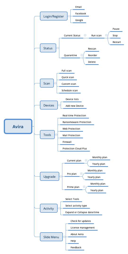
Information Architecture / Site map
With the ideas more or less crystallised, the next activity
was to develop an information architecture and think about making a user's journey
through the app seamless. I then created a content taxonomy map, to give meaning
to the defined features, and a sitemap to organize the pages, information, and
navigation of the app.
I also created a user flow for the key tasks within
the app: Scanning, Upgrading, Scheduling the scan, Review
Quarantine and Delete threats, etc. By going through the flow of the key tasks it helped
me to think through the core activities and ensure a seamless process from all
perspectives.
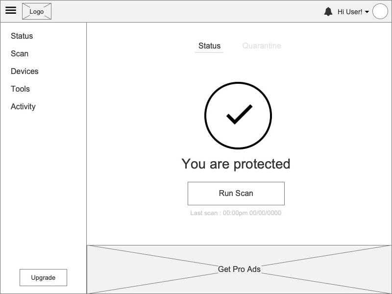
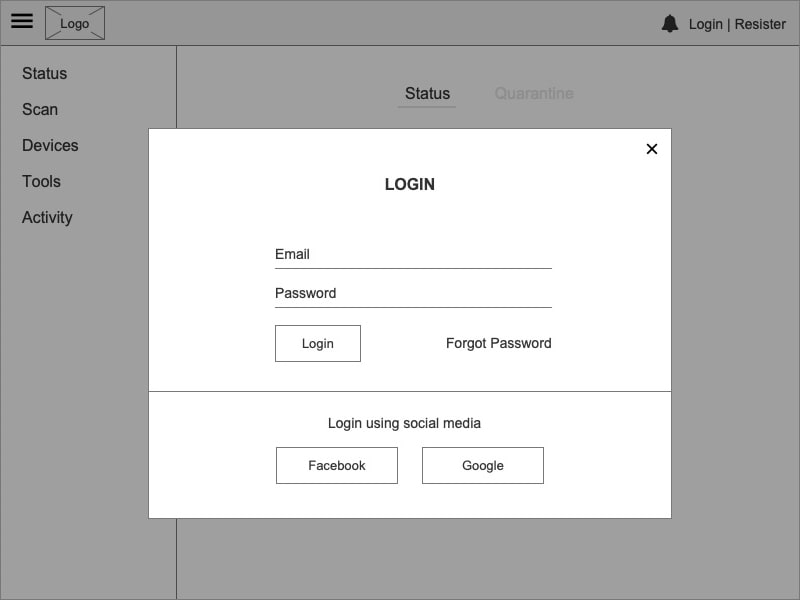
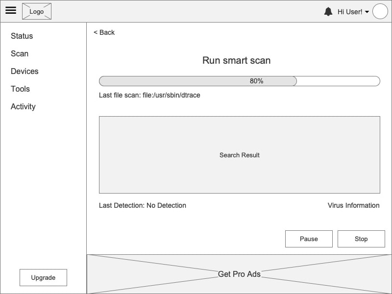
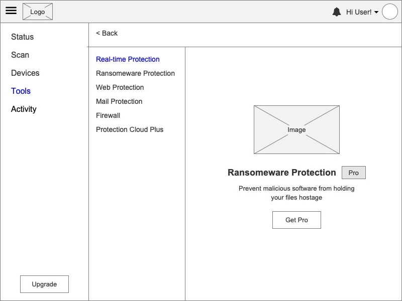
Wireframe
For wireframes, I carefully went through the UI of Avira app
and its competitors. After making some observations, I sketched out all the possible
layouts and finally came out with the one that worked the best. This allowed
me to prototype solutions for the main screens before committing to high fidelity
designs.
Now that I had a better understanding of who I was designing for
and felt equipped with my background research, I moved
on to the good stuff!
Design System
Once I locked our architecture, user flow and wireframe, I then established a design system and visual design style that communicated the Avira’s branding style.
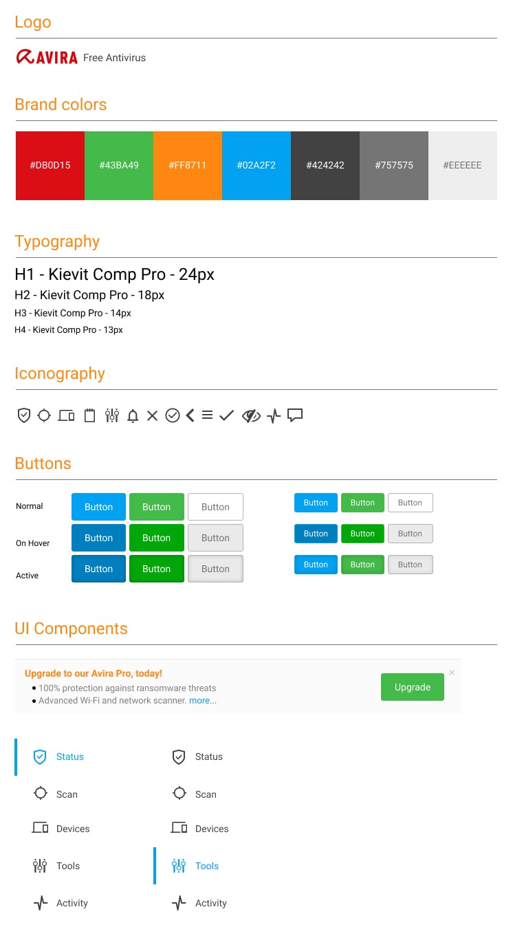
Visual Design
As I thought about how a user would move through the app, I designed each visual touchpoint to follow consistency and create delight. I followed common interaction patterns that users are already familiar with to make for an intuitive user experience.
Learning
This was a really exciting and fun project for me to work on as it provides real value, involved a ton of research, and detailed interaction work. I learned some important takeaways from this project related to product and business processes.